


Over the course of the past academic year, my skills have improved greatly with both Photoshop and InDesign, and I feel this has been proven when you compare my finished music magazine to its preliminary task. Before beginning in September I had very little experience in either program, yet now I am comfortable with using the two and am able to operate them in ways I previously never expected possible. The preliminary allowed me to grasp the entire concept of creating a real media product through practice, and then I could learn from any mistakes made and later apply this to my main task for the better.
When reflecting back at both finished magazines, there is a noticeable difference and an evident leap in quality in the second. Although at the time I was pleased with what my preliminary evolved into to, I had struggled and am now able to spot many ways in which I could enhance the overall creation. The layout looks far too bare due to a lack of headlines, and these are vital in order to convey a relaistic magazine and attract the buyers wanted. A house style may appear present, but I believe that too wide a range of colours are used which may suggest inconsistency so would change this if I were to ever re-do the project. I also had a better understanding of each programs tools the second time around, so with these abilities I was able to manipulate images and help them look more attractive and captivating to the reader. Perhaps it may be unfair to compare Dare's contents page to its predecessor, because the preliminary's was only meant as a draft, however I do believe it is missing many typical conventions of any magazine, by an extortionate measure. I also learnt how to manage my time a little more carefully, as in the first task I had jumped head first into creating the magazine, without making any plans of design or much research. In the following main task I made certain to analyse existing media products further within the same magazine market beforehand, and these helped for inspiration, conjuring many potential ideas for my own structure and layout. I realised that research was essential in order to convey a genuine, real music magazine, otherwise I would have little knowledge of the usual conventions included.
 item of software I was introduced to was Adobe Photoshop CS4, and this played a crucial part in the entire creation of my magazine. I had limited experience in a similar programme, called GIMP (GNU Image Manipulation Programme), so this may be considered as a "head start", and quite beneficial for me. However, Photoshop is fairly more advanced therefore it took longer than expected to adjust to the changes between the two.
 ed quite dull and shady - which would not attract many readers. However, this fast and simple tool allowed me to brighten up the colours and create a more professional, asethetically pleasing look to them.
 This procedure is used for the pictures used in almost every magazine around today, even outside of the selection of music magaines I've studied. There are quite a few different tools available on Photoshop that allow you to effortlessly remove any spots or marks you wish to hide. I found myself using the Spot Healing Brush quite often, as it appeared to be the most effective at covering up all unwanted lumps and bumps. I also used the Smudge Tool, to help smoothen out the skin and help provide a more natural look. With the use of the Paintbrush, I am also able to add make-up onto Leanna's face to enhance her indie-styled look.
Here is the original and finished result, once completed the above steps. There is evidently a vast imporvement in quality between the two images, the second having softer skin and a bold burst of colour, making it much more likely to catch people's eye.
* Adding Shadows
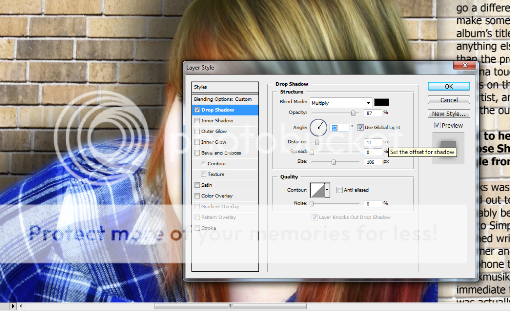
There are also plenty of other essential things I have learnt on Photoshop, throughout my progression of using the software. These include:
* Using the magnetic lasso tool and magic wand to remove backgrounds
* Cropping in order to select a particular part of a picture
* Creating text layers, adjusting their layout and how to text wrap
* Downloading various fonts and brushes for use within my magazine
* Adding various filters to alter an image and add appealing effects
* How opacities work, and how to change the levels of transparency
Although perhaps not as vital to the course as the previous, there were many other technologies used that assisted me in the design of my magazine:
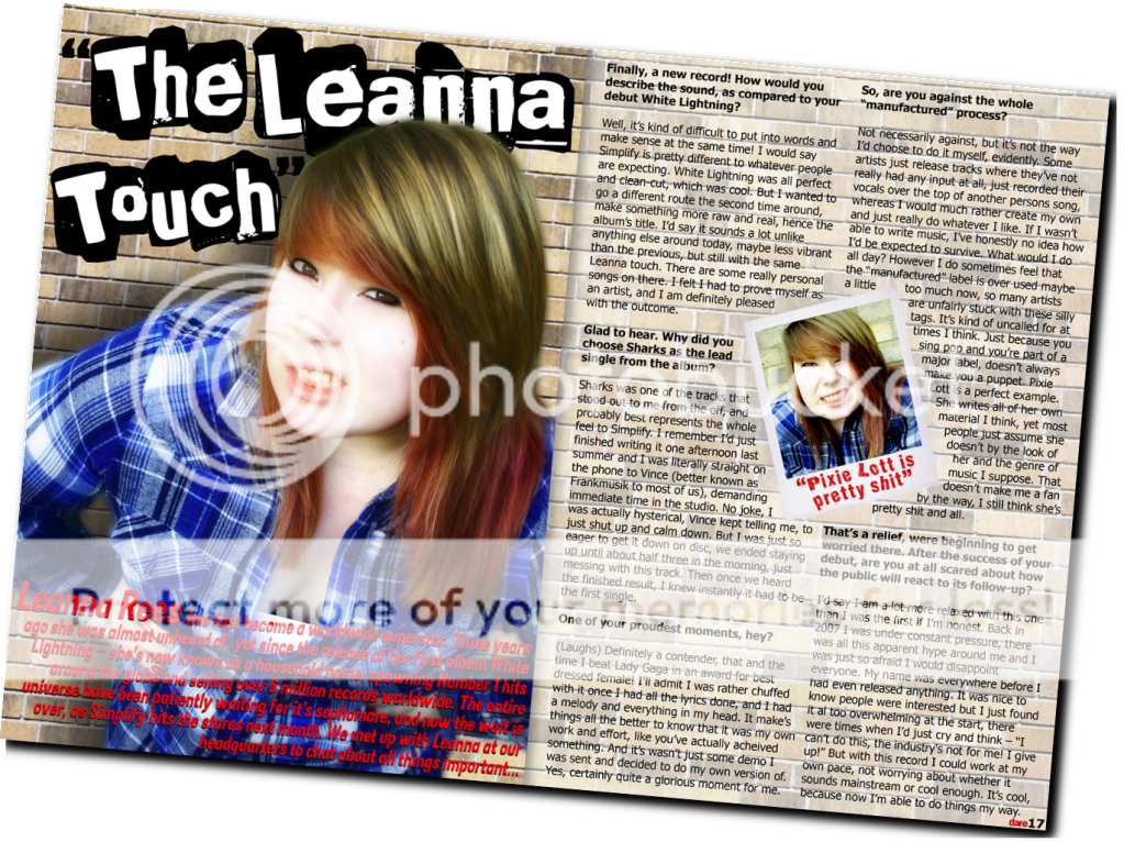
 the obvious pulls of attraction would be the artist themselves. On the front of almost every magazine of this type, the band or singers name would be printed on the cover in large, bold text - often greater in size than the actual magazine masthead or other embodied features, so they appear prominent. This would make it the centre of attention, proving their importance. Most magazine brands of this sort use music stars on their covers that would be instantly recognised by their target audience, and are likely to have a large following, therefore by flaunting the artists title, it will increase peoples chances of noticing the magazine and consequently making a purchase. I felt it was only evident th
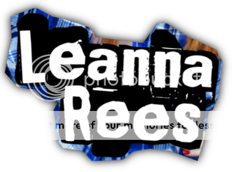 at I should do the same, assuming Leanna is a familiar artist within the specified genre, as this would attract interest from the many who are a supporter of her and at the same time satisfy the magazine's loyal audience.
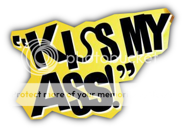 ent used to attract my target audience was the inclusion of a pull quote, extracted from the inner interview with Leanna. The pull quote is used as a bait to its audience, as it lures people in and further extends their interest in reading the magazine. It is essential to choose an effective quote from the artist in order to create this desired impact, as something too minute or insignificant would not excite the potential buyer into wanting to learn more. To serve its purpose, it must be able to schock and entice the reader, so the most controversial statement spoken within th interview is often used, as shown above with the phrase "Kiss my ass!" I believed it would improve sales of my magazine by the addition of a pull quote, stating "Now I can do it my way", in a bold red that leaps out from the page. This portrays a rebellious attitude, and with the word 'evolution' also
 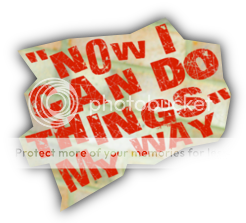 used among the heading, it suggests she has taken a change in direction, whilst unleashing a new sense of independence. As Leanna is supposedly a famous and global star within the music world, this should allure more people into purchasing the magazine, as they would be curious of Leanna's story and temptation will prevail.
 music industry, and would attract immediate attention from all that take notice of the genre. An even further list of artists were included within a "Band Index", printed on the contents page. They were each ordered alphabetically, so again, people are able to easily locate the musicians they enjoy and make a purchase if necessary.
To maintain a steady amount of readers, I decided to include a special offer on the contents page to those who pay weekly subscriptions of Dare, as it is also necessary to consider the future of the magazine. This should especially appeal to the already loyal followers of a magazine, as it would save them 75p with each issue. However, it may also convince others to become regular readers themselves. Many people within my target group, between the age bracket of approximately 16 and 22, are likely to struggle to afford purchasing every issue at its usual price. This is because they are often still students within education, and perhaps without an occupation - so therefore would have very little income of their own, if at all. This reduction in price would induce its potential buyer and prompt many into paying for the subscription.
UPS: Unique Selling Point
In order to distinguish my music magazine from any other and help it stand out from the crowd, a UPS is important. Dare shares similar music tastes to those included in NME, so I must ensure that I include something that would undoubtedly seperate the two. NME tends to focus on festivals, gigs and the live aspect of music, whereas my magazine will be essential for all the latest news and freshest releases. By issuing Dare every week, it would not give enough time for the news to become "out of date", therefore offering exclusivity to the buyer.
Male: 73%
Target Market: Men 17-30
Median Age: 25
My Audiences Taste In Music? Indie/alternative/electronica, artists that are often not too well known within the mainstream and could be considered unique and versatile, rather than generic and commercial - eg. MGMT, Delphic, Florence & The Machine, Mumford & Sons, The XX. Each of these were mentioned on my contents page which should assist in attracting these people.
Their Clothing? Often very casual, or supposedly "cool and trendy" - vintage, preppy, retro, mix & match; shopping at places like Topman/shop and Hollister. Plaid shirts, floral patterns & skinny jeans etc would be worn, and this style of fashion runs through my magazine, shown by the clothing worn in its cover feature, Leanna.
Their Favourite TV Programmes? Music channels such as VIVA and 4Music, teen dramas including Skins and The Inbetweeners, comedies, reality shows or documentaries - as I view my target audience as quite artistic, intelligent and well educated, therefore finding interest in learning about new things or experiences.
Their Main Interests & Hobbies? Attending gigs and festivals, socialising with friends (and parties), shopping, travelling, writing and reading - quite music orientated.
Socio-Economic Groups
It believed it was important to research the different socio-economic groups before producing my magazine, so that I was able to categorise my own target audience. I found the following information on a site called Market Research World:
"Market Research agencies often divide the population into different groupings, based on the occupation of the head of the household, for the purpose of drawing comparisons across a wide range of people - it is used to see how people in differing socio-economic situations react to the same stimuli. The groups are most often defined as follows:-
A- Higher managerial, administrative, professional e.g. Chief executive, senior civil servant, surgeon
B - Intermediate managerial, administrative, professional e.g. bank manager, teacher
C1- Supervisory, clerical, junior managerial e.g. shop floor supervisor, bank clerk, sales personC2 - Skilled manual workers e.g. electrician, carpenter
D- Semi-skilled and unskilled manual workers e.g. assembly line worker, refuse collector, messenger
E - Casual labourers, pensioners, unemployed e.g. pensioners without private pensions and anyone living on basic benefits"
 not fit into any of the various categories. To the left is a spider diagram I located at UKTribes.com, and its represents the different social groupings currently in Britain. My magazinne has a clear niche audience, and is aimed at people with a liking towards indie music, so I should focus my attention more to the groupings within the Alterntative category. Nevertheless, I still believe this is too vast a classification, and the arrangement is not specific enough, as I doubt goths would find much enthusiasm when reading my magazine - as they have their own specialised tastes in music as well and would most probably disapprove of the leading genre in Dare.
I have concluded that Dare will be distributed weekly by Bauer Media. NME and Kerrang! are two already popular music magazines that are published every week, and they share a similar price to my own, so I believed it would be suitable to do the same because £2.20 is far too cheap for the cost of a monthly magazine when compared to the others. I also intended mine to be very current and up-to-date, so that my readers are able to keep informed of all the latest news within the indie scene, so it is necessary for the magazine to be published every week, in order to be conisdered valid and reward a sense of exclusivity to the buyer. I believed Bauer would be the most appropriate choice of publisher for my magazine because there is currently no other sold by them that is of the same genre, and a lot of promise is shown after observing their circulation figures. I decided that IPC Media would be unsuitable for the distribution of my magazine, as it is too alike their own weekly music publishing, NME. This would cause serious competition between the two and a likely risk of both our sales decreasing, so this situation should be best avoided.

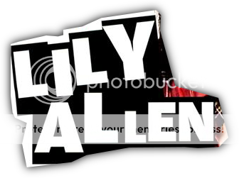
Within the magazine market, I would say that Dare is most alike NME, it being my main source of inspiration when producing the publication. NME may be conisdered to have a niche audience - a very specific segment of readers, and this is likely to be the case for my own due to the similarities in music genre. I believed it was vital to use somebody on the cover who is within the same age range of my targeted audience, as it would allow more people to understand and relate to the artist, therefore I deemed Leanna apropriate for the role. I thought I would compare my own cover image with another picture taken from an older copy of NME, in an article about Lily Allen. It is evident that there are multiple similarities between each photo, such as pose, costume and camera angle, which is vital if I want to convey a realistic media product.
The first thing that may be most noticeable is the matching in clothing between the two artists. Both are wearing loose-fitted plaid shirts, although different coloured, and are dressed in a casual manner. They have an untidy look to their appearance, with their hairstyles also purposely styled in a rugged, scruffy way, which well portrays the traditional indie, cool and contemporary kind of style, and is commonly worn by the youth of today. If I were to dress Leanna up more elegantly or seductively, this would detract from the artist herself and portray her as the opposite to what she supports. Leanna prefers to be renowned for her music rather than fashion or lifestyle, so wears what she feels comfortable in rather than what may be viewed as "more attractive".
Lily and Leanna are also posing very similarly. Both are leaning forward with their head raised so they are staring directly at the camera, although Lily's is tilted more to her right. Leanna's photo was taken as a high angle shot, whereas Lily's is almost directly at eye level. This could be conveyed either way, with a suggestion of dominance or superiority to the character, or perhaps even vulnerability. Direct eye contact with the reader provides a sense of intrigue and provokes its audience into wanting to learn more of the artist, consequently buying the magazine issue. Leanna's eyes are also slightly squinted, as though she is "giving evils", and her glare suggests she can be ruthless and has a hardened edge to her charcter. Their mysterious, perplexed facial expressions may also suggest they hold a secret, one that would be revealed throughout the article - again, convincing people into purchasing the magazine. Their posture also symbolises confidence within themselves, as their hands are placed on their hips and this could often suggest that they are courageous and determined in what they do. Their poses may also convey a daring attitude, which would undoubtedly support my choice in title and merge well with my entire idea for the magazine. This, along with the sensibility shown in the interview itself, could portray the specified social group in a positive light as it suggests dedication from Leanna, and faith in being herself, which may encourage young people to change their behaviour and show their individuality - or the older to change their opinions of typical stereotypes.
 Title & Logo
When first deciding on a title, I had trouble finalising my choice. I'd noted down any keywords and phrases I found suitable as a possible title for my magazine, however I was unable to pick a favourite. I wanted something that would entice the reader and hook them in, provoking many a potential buyer, although still incorporating a relation to the magazine's overall genre. I thought it would best to confront my other classmates and ask for their feedback, although this still had been little help, as my list appeared to split opinions. Therefore I eventually had to decide for myself and believed that Dare would be best suited as the magazine's title. I had liked this particular one from the start, as it is has a hidden kind of power behind it. The title's harsh sounding in its prefix, with the 'd-' sound, is short but effective and instantly engages its audience. This and the actual words meaning suggests that the magazine is different from all others, and 'dares' to go where they don't, meaning it is superior to its competition within the industry. It also gives a sense of exclusivity to the reader.
Next, I had to create a logo to go with my title, which was to be used throughout my entire magazine design. I had done my own research and taken my inspiration from a selection of other popular magazines currently available, concentrating on their masthead. The colours red, white and black kept re-occurring on my search, so this was evidently a typical choice of colours to be used, for them to be constantly appearing. I had began experimenting with various hues but felt that red would be the most suitable option because it is a very bold colour and can symbolise danger, which ties in perfectly with the title and can help to appeal to its target audience even further. Mise-En-Scene of Images
 n cover image of a magazine is often the first thing that catches the attention of passers by, so it is extremely important that the picture used is enough to engage the reader and persuade them to pick up a copy and read onwards. I made sure that all of my images throughout developed and challenged the usual elements of a real media product in order to pull more people in and gain these extra buyers.
To achieve this, I first had to make sure the image is taken in a certain way. Eye contact is essential, as this makes the reader feel as though the artist is looking directly at them, therefore influencing them to want to know more by suggesting the interview inside is honest and personal. Her expression on her face helps support this, as she is looking quite serious and almost emotionless. However, inside the magazine I decided to use a variety of images within the magazine to show the fun side to Leann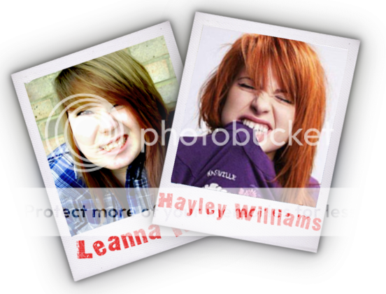
With the use of Photoshop, I was also able to add make-up, smoothen out her skin and bring out certain colours so that they jump out from the page, which again can only appeal to the audience even further. This is most evident when you compare an original image with the finished, edited version, which was eventually used in the making of my double page spread. 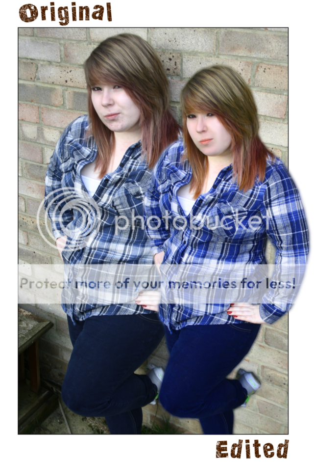
The background is another factor of my images that could challenge other media products. I decided I wanted something not too simple yet not too busy, as it would distract from the artist and its surroundings - such as the headlines. A background I discovered that was commonly used in other shoots for famous singers and bands was a brick wall, so I thought it would be a good idea to follow this trend and use it as my own. I believed that this matched Leanna's style of music, because in a way it portrays that she is a true, home-grown talent, whereas if she had been dressed up glamorously in fore of a fancy background, it would present her as the opposite and more of a model than a singer - which is her profession and what she focuses her attention to.
- Examples -

Costumes & Props
 My model wore a blue checkered shirt for the photoshoot, and a white vest underneath. These types of shirts are nowadays regarded as 'trendy' and are commonly worn within the indie scene, as it gives a rough and edgy look that bodes well with their style of music. I spotted many being worn on the covers of various issues of different music magazines, all associated with similar genres of music as included in Dare, so I believed this would be the best choice of outfit for Leanna in order to represent her music.
- Examples -

I had originally intended to use a prop with the model on the cover or throughout the magazine, as I had plenty of ideas and visions for how I wanted things to look. However, after browsing the Internet and doing my research, I realised it was very rare for a prop to be included in this style of magazine. Musical instruments were occasionally used, although not too often. Once this was considered, I decided to scrap any previous plans and instead photograph my model alone and without a prop of any sort. This again helps create more realism for my media product.
Written Content
In order to create a sense of intimacy, I used language that appeared spontaneous so that Leanna is presented as a relaxed and easy going individual. Explicit language was included, to prove to readers that she is a genuine and ordinary character, therefore she seems approachable by its audience because some may share her thoughts or opinions. However, there is not too much of it as that may present the magazine as distasteful, or Leanna herself as quite rude and disrespectful. Slang and "broken English" was also used throughout to emphasise this further, with phrases such as "no joke", "just really do whatever" - and the random addition of the word "like" throughout sentences. This again constructs a feel of reality to the article. I included language devices among the interview to support earlier points and engage with my target audience, by the use of rhetorical questions from the artist (What would I do all day?), and the questions asked by the interviewer are presented in a friendly tone as though they are having a usual conversation, so that probing questions don't appear too exposed and involves the reader, creating a welcoming atmosphere for them.
Colour & Layout
I have used a distinctive house style throughout the making of Dare, the colours red and blue running throughout. All other magazines I had researched appeared to follow a particular theme in colour and layout, therefore I believed this was necessary to do the same, so that the product had its own recognisable look whilst presenting conventions of a genuine media product.
The colours blue and red were specifically chosen, as they were taken from the colouring used within the pictures. The blue was collected from the shirt worn by Leanna, and the red from her nail varnish - and more noticeably, from the magazine masthead itself. These colours also reoccured on my contents page, to create this bold and striking house style. Too much variety in colours may cause them to clash, and instead look untidy rather than appealing, so I thought it was important to keep things relatively simple. This was also constructed with the use of a white background on the contents page, as a bright and brash colour or pattern would again detract from its actual content and make it appear too overcrowded and busy. Another feature I also added was a 'Band Index', a list of artists in an alphabetical order and the page number in which they are mentioned. This allows fans to easily locate where particular bands are within the issue. These seemed to be used regularly in some music magazines, therefore they are likely to be successful and decided to include one for my own.


* Album/Single/Gig Reviews
* Upcoming Bands and Releases -> "Ones To Watch For 2010"
* General music news
* Interviews with other artists
* Charts eg. Top 10 Songs/Artists of the Week
* Live Backstage -> Festivals
* Special "one-off" features -> records of the year, best of British, articles on particular genres etc.
* Letters or readers opinions?


Audience Feedback:
"I really like how her shirt compliments the union jack in this. Also, the red coverline looks really good at that angle and frames her face really well." - Charlotte Bailey
"Very nice! I love the fonts you used for "The Evolution..." and "Now I can...". Not really sure about the need for the "I am not a robot" on the bottom right, but then again I'm not really up with the standards of the cool kids today.
The use of the Union Jack for the badge thing was a really inspired idea, and as Charlotte said the colours compliment each other nicely.
Well done." - Chris Coales
"This is actually a really good picture and a great angle. I think is was a great idea taking the picture of her against a wall. Your title is very nicely done and the point of the first letter of the word being a small letter is extremely effective. agree with chris about the fonts and colours used, however more text or small pictures could be added, perhaps a small advertisement of the release of her new album/single. The sticker on the outside is good, but very bright. I think you should reduce the opacity of the union jack in the background. :D" - Nathan Sundin
"Really good, i like the way her shirt compliments the union jack sticker, and how her head overlaps the masthead :)
Only thing is that you could maybe fit in a couple more cover lines." - Alysha Bennett
"I like the use of colour scheme in your front cover. The blues of the shirt compliment the clear logo of the union jack in the corner as well as the red and white text. The layout of the magazine is also very good, with a lot of white space taken up. Also, the colours in your models hair add variety on the page. I would only suggest adding a few more cover lines, such as band names or other competetions. :)" - Ben Allen
I intend to take all the advice given on board, and improve the things mentioned with my second draft.


