In what ways does your media product use, develop or challenge forms and conventions of real media products?
My aim was to create an exciting and unique music magazine, although approaching it with a sense of realism by the inclusion of typical conventions used throughout the various magazines I had researched. I browsed copies of other popular publishings currently within the magazine industry to gain inspiration for my own designs, such as NME, Q and Kerrang! I chose to analyse these in particular because they all share similar tastes in genre of music, being more indie and alternative influenced. This was the trend I had planned to follow for my own magazine, because it is the style in music I am most interested in and feel I can comfortably relate to when writing the article. I had experience in reading plenty of these types of magazines, so believed this would be best appropriate.
 Title & Logo
When first deciding on a title, I had trouble finalising my choice. I'd noted down any keywords and phrases I found suitable as a possible title for my magazine, however I was unable to pick a favourite. I wanted something that would entice the reader and hook them in, provoking many a potential buyer, although still incorporating a relation to the magazine's overall genre. I thought it would best to confront my other classmates and ask for their feedback, although this still had been little help, as my list appeared to split opinions. Therefore I eventually had to decide for myself and believed that Dare would be best suited as the magazine's title. I had liked this particular one from the start, as it is has a hidden kind of power behind it. The title's harsh sounding in its prefix, with the 'd-' sound, is short but effective and instantly engages its audience. This and the actual words meaning suggests that the magazine is different from all others, and 'dares' to go where they don't, meaning it is superior to its competition within the industry. It also gives a sense of exclusivity to the reader.
Next, I had to create a logo to go with my title, which was to be used throughout my entire magazine design. I had done my own research and taken my inspiration from a selection of other popular magazines currently available, concentrating on their masthead. The colours red, white and black kept re-occurring on my search, so this was evidently a typical choice of colours to be used, for them to be constantly appearing. I had began experimenting with various hues but felt that red would be the most suitable option because it is a very bold colour and can symbolise danger, which ties in perfectly with the title and can help to appeal to its target audience even further.
Once I had settled on a colour, my next job was to decide on its font. I needed to make sure it fitted the magazine's theme I had earlier chosen, focussing on the indie and alternative scene - so I had to make sure this was reflected in its font. I browsed various sites which would allow many free fonts available for download, such as dafont, and began the find for the perfect font to be used on my desired magazine. When previously researching logos already famous in the publishing world, I liked the look of both the NME and Kerrang! designs, and figured it may be a good idea to combine the two together to form my own. NME's appears as quite simple although very prominent, with the use of large capital letters and a bold black/white outline. Kerrang! however, is almost the opposite, as it looks very worn and distorted, presenting the magazine's 'rock' theme very clearly. The eroded look is nowadays very fresh and modern, commonly being used when associated to this genre of media products, therefore I thought it would be a great choice if I wanted to convey my magazine's theme as obvious as theirs. Although, I will not use this effect as heavily as shown, because my magazine follows the trend shown in NME more than it does in Kerrang! I eventually settled on choosing Dirt2 Stickler as my finalised font, so all I had left to add was the finishing touches. I added a black shadow and outline to the logo, similar to as shown in that of NME, and with the use of the bevel & emboss tool I gave it a glossy effect to add a little sophistication to the design and help it stand out from the page.
After it had been finished, I placed it along the other logos I had seen in order to compare them. I believe my logo portrays the forms and conventions set by real media products, as it doesn't feel out of place and appears believable when placed along with the rest. Mise-En-Scene of Images
The mai n cover image of a magazine is often the first thing that catches the attention of passers by, so it is extremely important that the picture used is enough to engage the reader and persuade them to pick up a copy and read onwards. I made sure that all of my images throughout developed and challenged the usual elements of a real media product in order to pull more people in and gain these extra buyers.
To achieve this, I first had to make sure the image is taken in a certain way. Eye contact is essential, as this makes the reader feel as though the artist is looking directly at them, therefore influencing them to want to know more by suggesting the interview inside is honest and personal. Her expression on her face helps support this, as she is looking quite serious and almost emotionless. However, inside the magazine I decided to use a variety of images within the magazine to show the fun side to Leann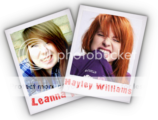 a. I included images of her pulling silly faces that would lift the mood and entertain the reader at the same time. These can portray the artists personality and help prove she is a down to earth character who the reader can relate to, as she doesn't take herself too seriously.
With the use of Photoshop, I was also able to add make-up, smoothen out her skin and bring out certain colours so that they jump out from the page, which again can only appeal to the audience even further. This is most evident when you compare an original image with the finished, edited version, which was eventually used in the making of my double page spread.
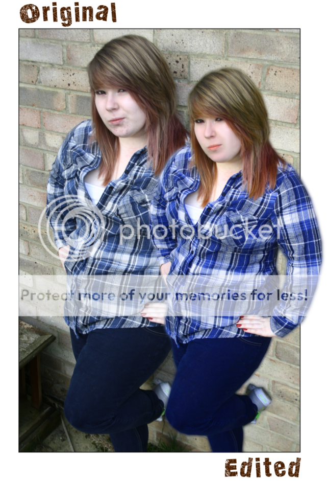 The second is clearly more attractive to the reader as it appears quite bright and colourful, whereas the first looks too grey and may disinterest some.
The background is another factor of my images that could challenge other media products. I decided I wanted something not too simple yet not too busy, as it would distract from the artist and its surroundings - such as the headlines. A background I discovered that was commonly used in other shoots for famous singers and bands was a brick wall, so I thought it would be a good idea to follow this trend and use it as my own. I believed that this matched Leanna's style of music, because in a way it portrays that she is a true, home-grown talent, whereas if she had been dressed up glamorously in fore of a fancy background, it would present her as the opposite and more of a model than a singer - which is her profession and what she focuses her attention to.
- Examples -

Costumes & Props
 My model wore a blue checkered shirt for the photoshoot, and a white vest underneath. These types of shirts are nowadays regarded as 'trendy' and are commonly worn within the indie scene, as it gives a rough and edgy look that bodes well with their style of music. I spotted many being worn on the covers of various issues of different music magazines, all associated with similar genres of music as included in Dare, so I believed this would be the best choice of outfit for Leanna in order to represent her music.
- Examples -

I had originally intended to use a prop with the model on the cover or throughout the magazine, as I had plenty of ideas and visions for how I wanted things to look. However, after browsing the Internet and doing my research, I realised it was very rare for a prop to be included in this style of magazine. Musical instruments were occasionally used, although not too often. Once this was considered, I decided to scrap any previous plans and instead photograph my model alone and without a prop of any sort. This again helps create more realism for my media product.
Written Content
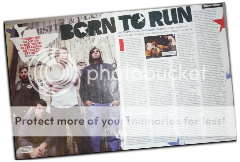 Writing the magazine article may be considered by some as the most difficult part of creating the product, as it is highly important that the artist interviewed is accessible and can easily connect with the audience. This can be done by the use of colloquial or natural language from Leanna, rather than a formal mode of address, which would present the artist as quite reserved or distant and perhaps discourage people from continuing to read the article or even purchasing a second issue. I had read similar interviews to this previously, and I realised that a series of robotic responses can quickly disinterest the reader, as the repetition in language would portray a false character, conveying too little of their personality.
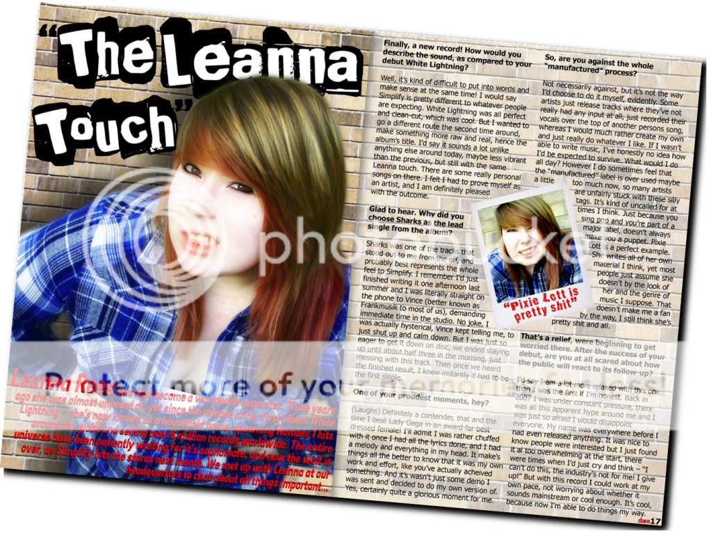
In order to create a sense of intimacy, I used language that appeared spontaneous so that Leanna is presented as a relaxed and easy going individual. Explicit language was included, to prove to readers that she is a genuine and ordinary character, therefore she seems approachable by its audience because some may share her thoughts or opinions. However, there is not too much of it as that may present the magazine as distasteful, or Leanna herself as quite rude and disrespectful. Slang and "broken English" was also used throughout to emphasise this further, with phrases such as "no joke", "just really do whatever" - and the random addition of the word "like" throughout sentences. This again constructs a feel of reality to the article. I included language devices among the interview to support earlier points and engage with my target audience, by the use of rhetorical questions from the artist (What would I do all day?), and the questions asked by the interviewer are presented in a friendly tone as though they are having a usual conversation, so that probing questions don't appear too exposed and involves the reader, creating a welcoming atmosphere for them.
Colour & Layout
I have used a distinctive house style throughout the making of Dare, the colours red and blue running throughout. All other magazines I had researched appeared to follow a particular theme in colour and layout, therefore I believed this was necessary to do the same, so that the product had its own recognisable look whilst presenting conventions of a genuine media product.
The colours blue and red were specifically chosen, as they were taken from the colouring used within the pictures. The blue was collected from the shirt worn by Leanna, and the red from her nail varnish - and more noticeably, from the magazine masthead itself. These colours also reoccured on my contents page, to create this bold and striking house style. Too much variety in colours may cause them to clash, and instead look untidy rather than appealing, so I thought it was important to keep things relatively simple. This was also constructed with the use of a white background on the contents page, as a bright and brash colour or pattern would again detract from its actual content and make it appear too overcrowded and busy. Another feature I also added was a 'Band Index', a list of artists in an alphabetical order and the page number in which they are mentioned. This allows fans to easily locate where particular bands are within the issue. These seemed to be used regularly in some music magazines, therefore they are likely to be successful and decided to include one for my own.


